This article applies to All editions.
The visual design of your community and projects keeps the look and feel of your testing platform consistent with your brand. But did you know it also helps maintain tester enthusiasm and participation?
Branding excites testers by immersing them in your product experience. Buttons that stand out help them navigate through your site. A good contrast between your background and text colors makes menus and content easier to read. Meanwhile, a poorly designed site can lead to confusion, lack of engagement, and even site navigability issues!
Visual Themes are created using the community level Visual Theme Management tool, and once created themes can be applied at both the community and project level.
Accessing Visual Theme management

From the Community Home:
- Navigate to your Community logo > Community configuration > Visual theme
- Click the Create a visual theme link in the top right
- Enter your desired theme name, as well as associated files and color choices
- Click the Submit button at the bottom of the page to save your theme
Setting a community or project level Visual Theme
To set a Visual Theme for your community:
- Navigate to your Community logo> Community configuration > Basic settings
- Select the Visual Theme you would like in the Visual theme dropdown
- Click the Submit button
To set a Visual Theme for an individual project:
- From the Project Homepage, navigate to Management > Project configuration > Project settings
- On the Fill in your project details page, select your desired theme from the dropdown menu.
If you choose <Community Theme>, your project will match your community's Visual Theme by default - Click the Submit button
We’ve gathered a few tips and tricks and example themes here to help you master Centercode’s Visual Theme tool to get even more engagement out of your program and projects.
Example templates
Here are a few examples featuring some great combinations of images and custom colors to get your creative juices flowing!
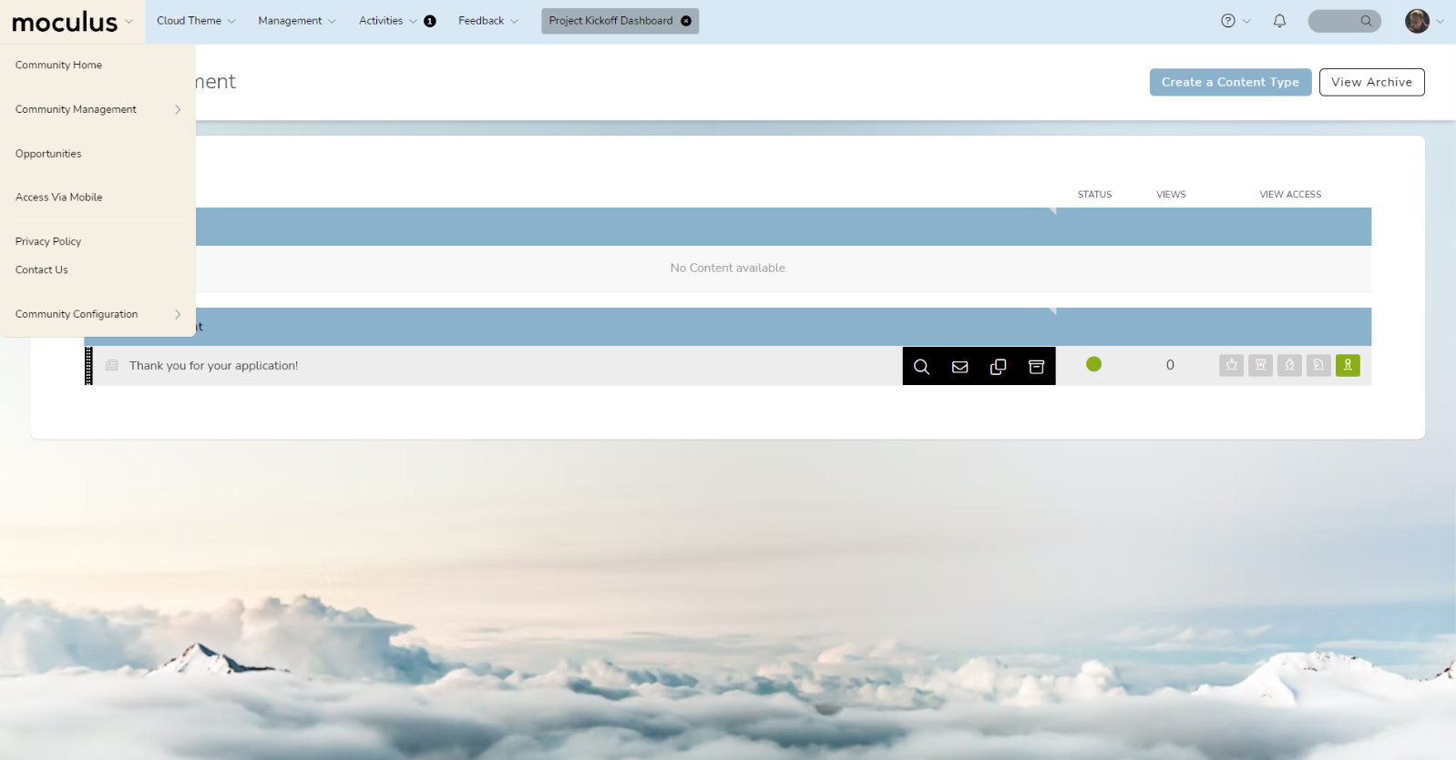
Clouds - Light Theme
(Custom Colors)(Inner Background Image)
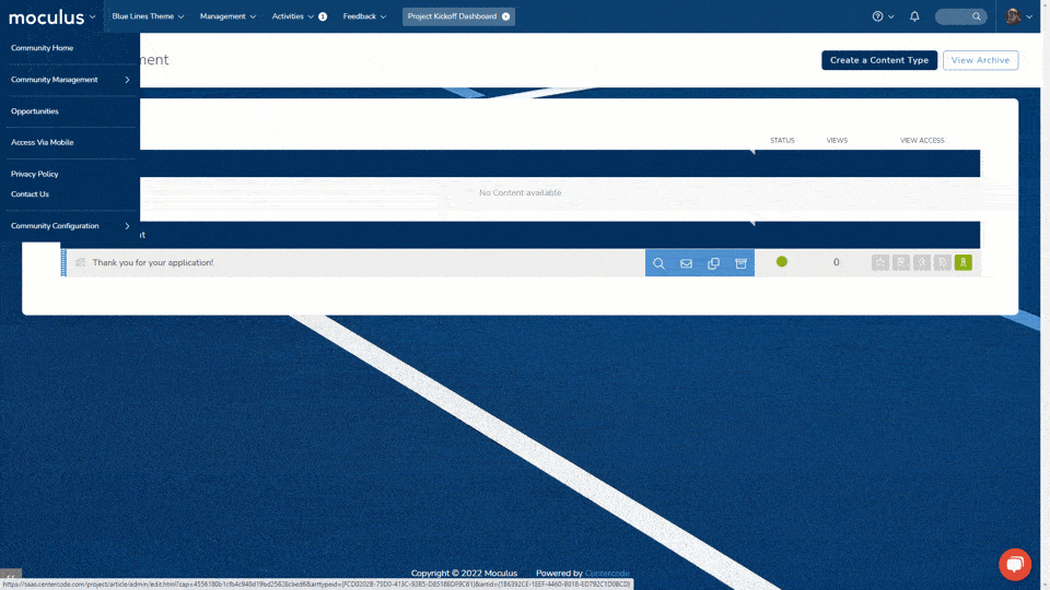
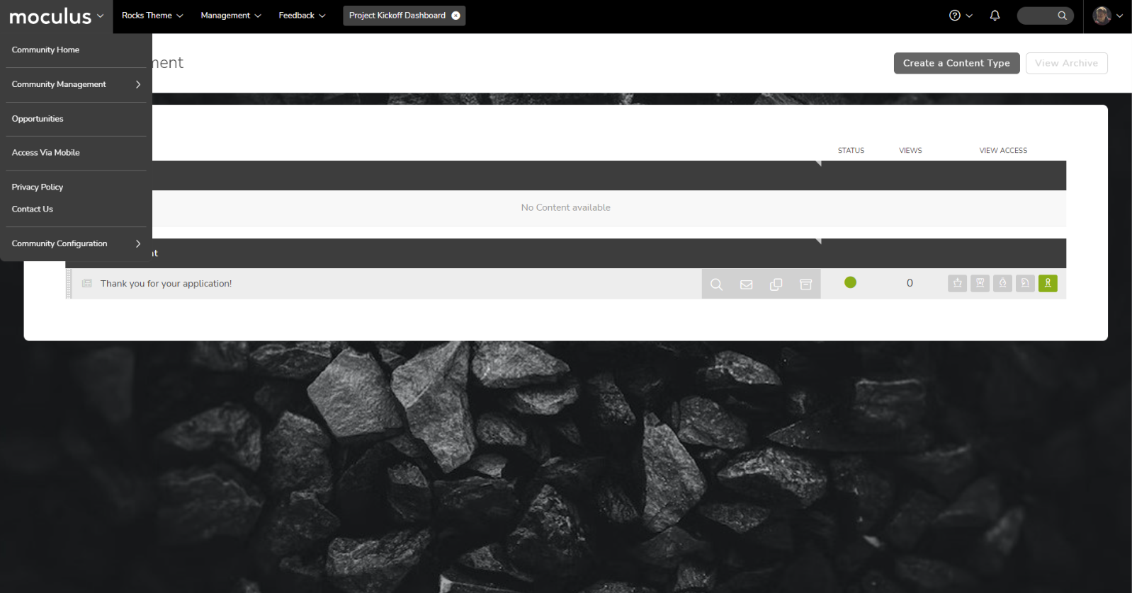
Rocks - Dark Theme
(Custom Colors) (Inner Background Image)
Plants - Colorful Theme
(Custom Colors) (Inner Background Image)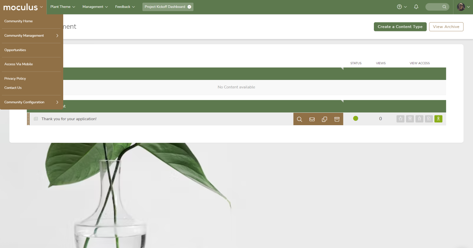
Tips, tricks, and best practices
- Choosing Images
- Use a logo with a transparent background. (Avoid This!) We recommend SVG or PNG files for logos because they support transparency.
- If you're using inner/outer background images, backgrounds with low contrast, subtle textures, soft/blurred focus, or gradients are your best bet. Bright, saturated colors and busy patterns tend to distract the eye, making your site harder to read. When in doubt, play with a grayscale or monochromatic background image.
- Changing the color of the carets on your site header and dropdown menu to one of your primary logo colors can add a lot of visual flair to your navigation bar. Try it out!
- Choosing your colors
- Select three or four distinct colors for your visual theme based on your brand. A simplified color palette not only makes themes easier to manage, it also results in a focused look that is easily recognizable.
- Making your logo pop
- Check the contrast on your logos. Remember that opposites attract: if you have a light logo, consider a dark menu color, and vice versa.
- Setting a project to have a different theme from the community will use the “Menu Logo” in place of the text of the project name in the menu, which can end up visually busy. Consider not using a menu logo for project-specific themes. (Example)
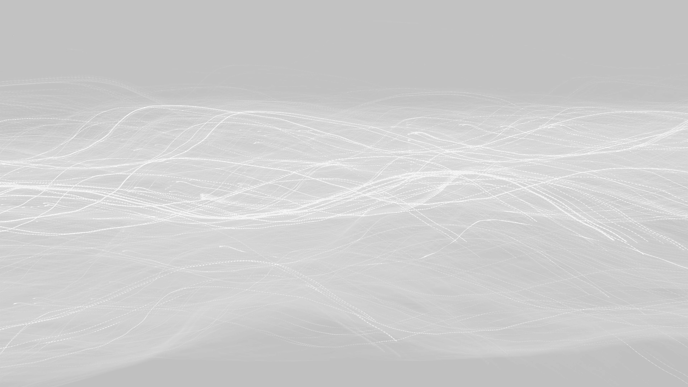
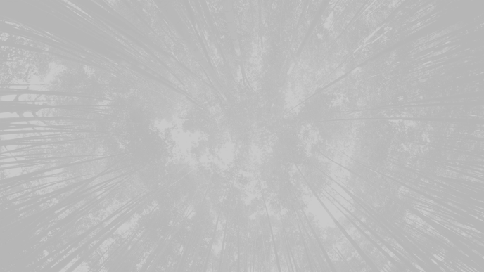
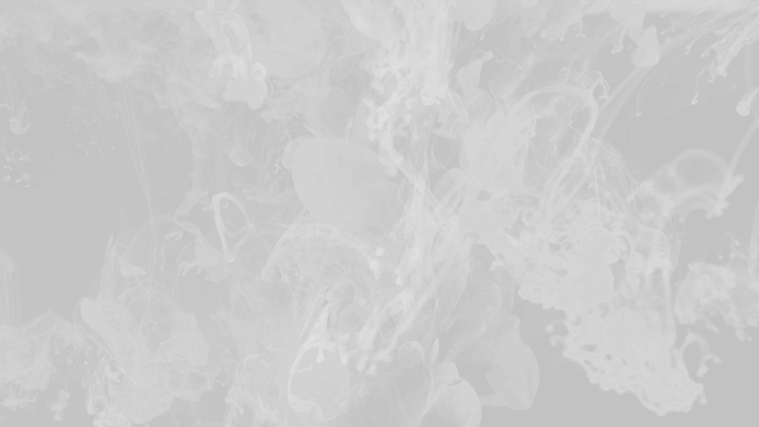
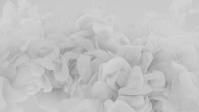
Background image library
In the spirit of creating high-quality and effective visual themes, we've provided a library of images you can use for your Centercode site's background. Each image below is monochromatic and semi-transparent, allowing you to apply an Inner Background Color which will "tint" them with whatever color fits best for your branding.
To use an image below, right-click it and "Save As" to save it in its original size. Then, simply follow the instructions in this article to add it to your Visual Theme.
Bonus*: Here's a ZIP of the whole set so you can go wild!
*for more advanced and/or particularly adventurous users only! 😎
 |
 |
 |
 |
 |
 |
 |
 |
 |
 |
 |
 |
 |
 |
 |
 |
 |
 |
 |
 |
 |
Additional resources
To learn in detail what each of the Visual Theme image and color settings apply to click Here