This article applies to All editions.
Knowing which color to use, and where, goes a long way towards creating a professional site that is visually appealing. Here's a quick rundown of the Visual Theme custom image and color settings, as well as examples of the more prominent places they'll appear on your site.
Selecting your site theme colors
When you're creating or modifying a Visual Theme, you’ll see a section header titled “Select your site theme colors” Within this section, there is an upload window for your community logo, as well as five different color selection options.
- Logo
Appears within the top bar of the top left of each page (Example) - Menu bar - Background
Changes the background color of the navigation bar, its dropdown menus, and flyout menus (Example) - Menu bar - Accent
Changes the color of the carets used to indicate dropdown menus (Example) - General - Text link
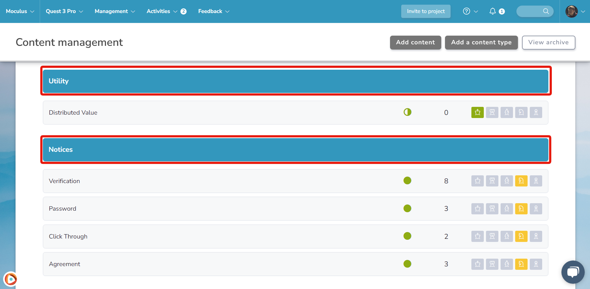
Changes the color of links located within pieces of content and forms (Does NOT include feedback ticket title links) (Example) - General - Primary brand accent
Changes the color of most buttons throughout the site (with a few exceptions controlled by other color selections) (Example) - General - Secondary brand accent
Changes the color of buttons that appear within forms and as alternate choices located near primary buttons, as well as table headings (Example)
Choose a page background
This section allows you to choose the background color or image that will be seen behind all of your internal (after users have logged in) pages, as well as the text and link colors in the background section of the site. The preview window will show you an example of how these color/image and text choices combined will appear on your live site.
- Background image
Appears behind each page for logged in desktop users (Example) - Background - Background/tint
Changes the color of the site background (will not be visible if using an Inner Background image) (Example) - Background - Text
Changes the color of text used within the background section of the site (Example) - Background - Text link
Changes the color of link text used within the background section of the site (Example)
Customize your sign-in and landing pages
This section allows you to choose the background color or image that will be seen behind all of your external (before users have logged in) pages, as well as the text and link colors in the background section of those pages. The preview window will show you an example of how these color/image and text choices combined will appear on your live site.
- Background image
Appears behind each external landing/login page for desktop users (Example) - Background - Background/tint
Changes the color of your external landing/login page background (will not be visible if using an Inner Background image) (Example) - Background - Text
Changes the color of text used within the background section of your landing/login pages (Example) - Background - Text link
Changes the color of link text used within the background section of your landing/login pages (Example)
Customize your site details
This section contains a few different extra options to further customize the look of your site, including the custom colors used in reports, report logo images, and the favicon that will be used by your site.
- Custom colors
Custom colors allow you leverage your brand colors throughout the site, including WYSIWYG editors, reports, and dashboards. Updating these colors will be automatically reflected in these areas (Example) - Email and PDF logo
Appears within system generated emails and exported PDF reports (I.e Recruiting invitations, etc) (Example) - Favicon
The small image that appears in the browser bar and bookmarks (Example)
Custom CSS
CSS is the language used to style an HTML document or website. CSS describes how HTML elements should be displayed. Through the use of custom CSS you can completely control nearly every facet of how colors are used within your site. Here are a few examples of how you can use custom CSS to customize aspects of your site. Simply insert the hexcode for the color you wish to use in place of #FF0000 in the example:
Table heading
Normally this section would use your secondary brand accent color. Here is how you would manually define a table heading color via CSS:
.listouter .rowgrouphdr {
background-color: #FF0000 !important;
}
Landing page login section
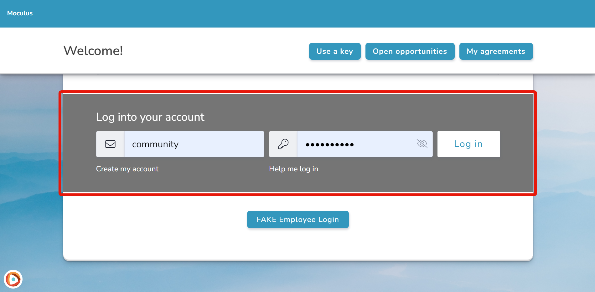
Normally this section would use your secondary brand accent accent. Here is how you would manually define a secondary landing/login page color via CSS:
.section-bar.section-bar--cta {
background-color: #FF0000 !important;
}
Landing page login button
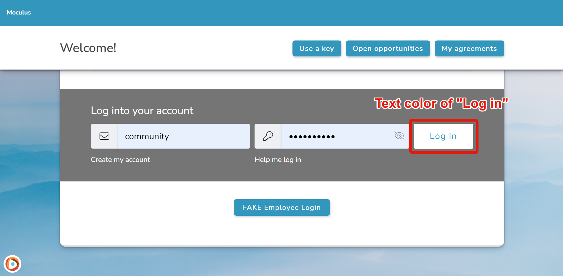
This is the button that appears on your login page. Normally it uses a version of your secondary brand accent, just like the landing page login above. Use this CSS to change the button text color:
.section.section-bar--cta.section-bar--cta-colors-inverted .bttn {
  color: #FF0000 !important;
}
Note: While Centercode will allow the use of custom CSS they essentially override the Centercode recommended and supported Visual Theme and site design settings and is done at your own risk. As such, we cannot officially support or assist with any changes made via custom CSS that may break between updates.