Learn about automated reports made possible by the Delta testing process!
This article applies to All editions.
What are Centercode’s Dashboards?
Dashboards organize the data generated by your project into easy-to-understand reports, graphs, and lists. Everything from the most impactful feedback, to engagement in the current phase, to top testers, and more can be displayed in a Dashboard.
Dashboards consist of individual panels displaying impactful information about your test. These panels contain your core KPIs - Project Health, Product Success, and Project Impact, as well as many other valuable sets of data. Panels often have their own subpanels which can be expanded to show more detailed contextual graphs and lists.
Why should I use Delta Dashboards?
Dashboards are designed to focus on important KPIs and metrics that help you monitor your project. They automatically update as your project progresses which allows you to have a deeper understanding of your project and the state of your product in real time. Furthermore, since Dashboards are system-built based on unique signals, they can display data in ways that Custom Reports can’t.
While certain dashboards can display valuable data for Beta projects, Centercode’s Delta Dashboards become extremely useful when your project follows a Delta approach. Based on the aforementioned signals, the built-in Dashboards present every valuable aspect of your Delta test without you needing to lift a finger. You can even present them from within your project or print them to PDF for easy distribution.
What Dashboards are pre-made?
The platform offers 7 built-in Dashboards for a Delta project. These Dashboards provide visibility into all the valuable data in your project. (If you have an idea for another valuable Dashboard, let us know!) The built-in Dashboards include:
Project Kickoff Dashboard
The Project Kickoff Dashboard is designed to be a starting point to guide you step by step through all of the necessary setup and settings required to get your Delta project off of the ground. Each step on this dashboard contains easy to use and understand buttons leading you right where you need to go to configure the related element, as well as helpful instructional videos to guide you through the process. By default this dashboard will be the first thing you see upon creation of a new project.
Delta Huddle
This Dashboard is an overview of the current phase designed to be used at the end of the phase to review the current state, findings, and next steps. It includes information from the prior phase, the current phase so far, and a preview of the next phase to ensure alignment.
Project Overview Dashboard
This Dashboard summarizes every aspect of your project in one easy-to-access and easily shared place. Everything from the health of your project, to your top feedback and Ted’s performance (if he’s enabled). Your Project introduction is also displayed here and is controlled via your Project Template Settings. Learn more about the Project Overview Dashboard here.
Feedback Impact Dashboard
This Dashboard illustrates Feedback Impact relative to the current scope: either Project (broken down by Phase), or Phase (broken down by Feature). You’re also shown your Project’s Top Feedback sorted by Impact Score.
Activity Engagement Dashboard
This Dashboard displays your Project’s tester engagement in relation to your product’s Features. You’re also provided with your Features’ cumulative star rating.
Product Success Analysis Dashboard
This Dashboard provides a unique way of looking at your project’s most impactful Issues and Ideas. The Dashboard will analyze your feedback and will default to suggesting that if you were to address 20% of your top feedback, you will address ~50% of the impact of your entire project.
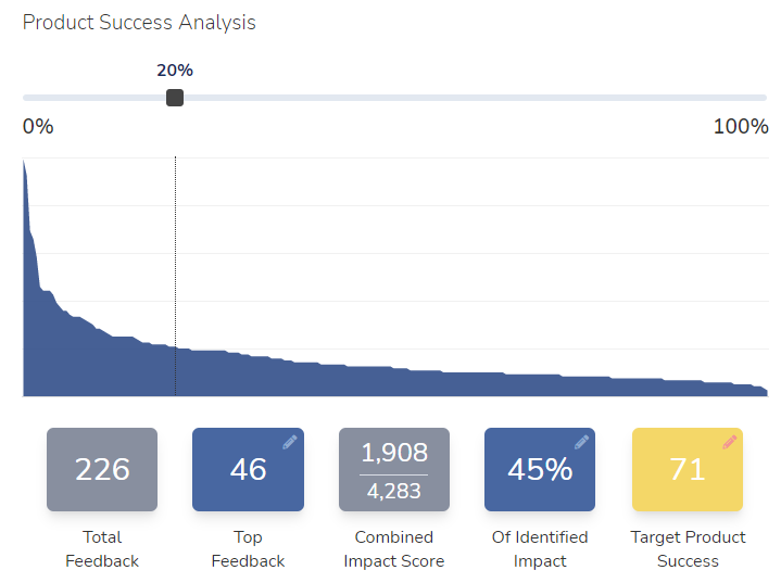 Using the example above, the project has a total of 226 pieces of feedback. By addressing 20% of the existing issues (where the slider is currently set), we can see how many of the top issues would be addressed (46) which would account for 45% of the identified impact. Using this curve, you can provide insight and prioritization to have the biggest impact on your product's success.
Top Feedback Dashboard
This Dashboard showcases your project’s top feedback items based on impact score. You can use the Dashboard filter options to narrow this down by feedback type, submitter teams, Phase, and more.
Top Testers Dashboard
This Dashboard ranks your testers by their cumulative Impact Score and also provides you with a high-level overview of their contributions to feedback and collaboration.
User Dashboard
This Dashboard displays an individual user’s contribution to your Project, their Project score, and their ranking. It’s accessed from the user’s card within a feedback ticket, as well as clicking into the user from the Top Feedback Dashboard.
How do I use Delta Dashboards?
Dashboards are available the moment you log into your project and are located right underneath the Navbar. You can also access Dashboards by clicking on the Management tab in the Navbar. Once on the Dashboard page, click on the dropdown menu to navigate between available Dashboards.
Dashboards can use Filters to display data from certain feedback types or teams. Click on the Filter Button to extend the Filter Bar. From here, you can select the teams and feedback types you’d like to see in the Dashboards. If you want an even more granular look at the data presented by a panel, click on Detail Mode at the top right.