Collect customizable reportable data with feedback forms, surveys, user profiles, and test platforms created via Centercode's Form Engine
The Centercode form engine is designed to provide a user-friendly experience for creating and managing forms within the Centercode platform. The form engine allow you to build custom forms for numerous different use-cases all via the same core tool, including but not limited to:
Surveys: Collect custom single-use forms from your testers for a wide range of purposes, including tester qualification information or feature/product deep dives. Hidden from the UI once completed.User profiles: Intended to collect user demographic data (e.g. language, technical experience, education), stored at the community level, and available for users to update as their circumstances change. Only one copy of each profile can exist but it can be edited at any time.Test platforms: Intended to capture user technographic data at the community level, such as information about their phone/mobile device, computer hardware, or other relevant technographic information. Users can submit multiple copies of each test platform and can edit them at any time.Feedback forms: The primary way you will capture user feedback about your product. Repeatable, customizable, and designed to work with numerous outside integrations like Jira and Slack. Users typically cannot edit their submitted feedback.
Creating a Form
Creating a form is done by navigating to the resource type of your choice and pressing the "Create a ..." button. For this example we'll use the common scenario of create a survey at the community level.
 Navigate to the survey management screen by clicking the upper left community menu
- Click the Community logo in the top-left
- Select Community management
- Click Surveys
- On the Survey management page click Create a survey
- Select Blank to create a fully custom survey
- Enter basic survey information (survey title, how it is shown in the menu, team access, etc)
- Click Next
- You will now be taken directly to the Create a form element page to create the first form element for your survey
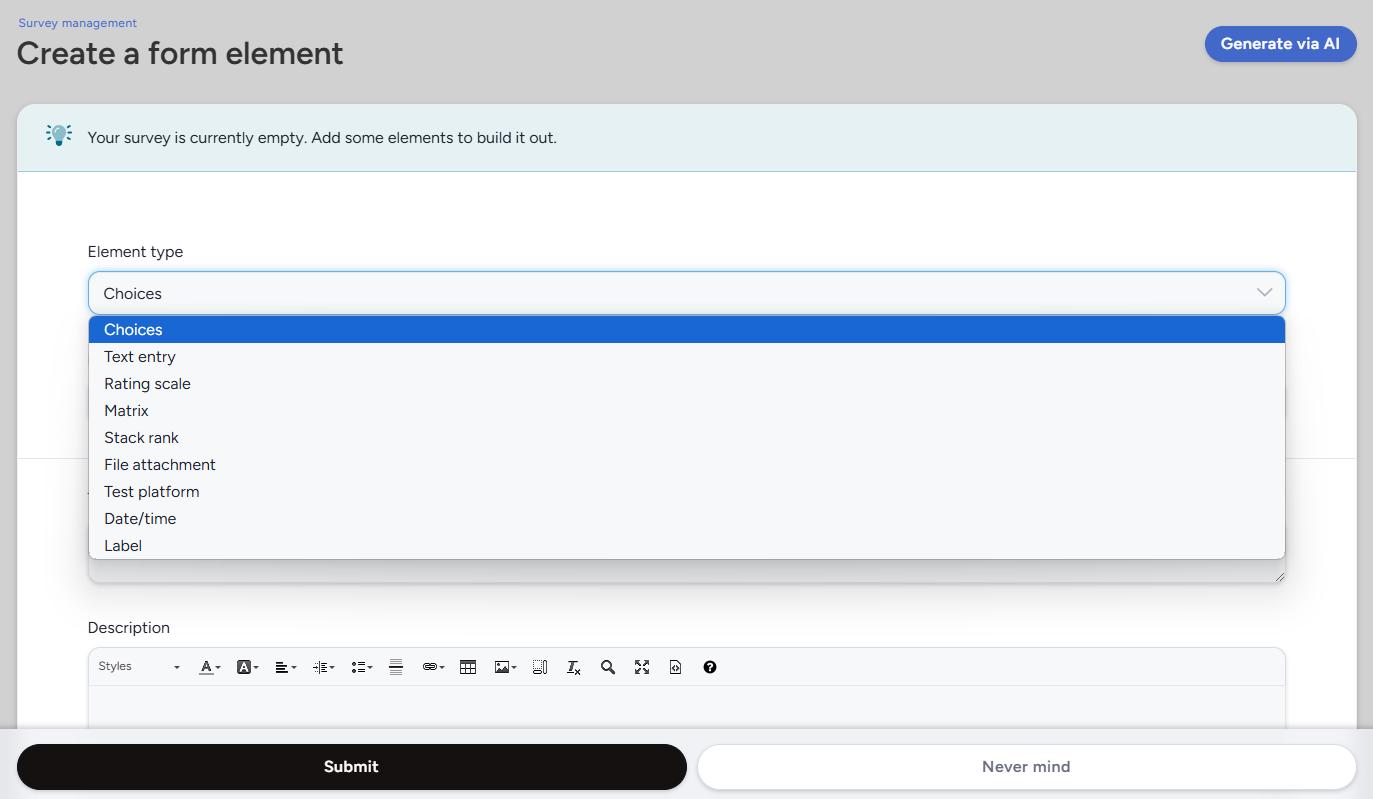
From here, you can select the element type of your choice. This determines the type of data collected and how your users will provide that information.
Form Elements
Element type
A form is comprised of any number of form elements. These elements come in a number of different types and functionalities. The available elements vary slightly depending on the form type.
Label: Used to give context to a form, providing detailed instructions, or serving as section headings. Not used to collect data.Text entry: Collect open-ended text responses. Can be used to collect short answers or formatted paragraph text, giving users access to the WYSIWYG editor.Choices: A predefined list of answers to select from, which can be formatted as a drop-down menu, horizontal or vertical radio buttons, or multiple-choice checkboxes.Rating scale: Allow users to select a rating from a predefined range, including the ability to collect NPS scores.Matrix: Rate multiple items using the same scale/set of choices.Stack rank: A custom list users can drag and drop in order of preference.File attachment: Allows files to be uploaded to the form. Can be set to allow a single or multiple files with a 5GB file limit.Test platform: Allows a user to specify which of their test platform devices this form pertains to. Allows single or multiple test platform selections.Date/time: Captures date and time on the form.Release: (Feedback only) Allows a user to specify which product release version they were using in relation to the submitted feedback (selection is based on releases you have created in that Centercode project).Internal notes: (Feedback only) Provides notes section which has its own team access. Intended to be used by support staff to leave notes that are not customer facing.Feature: (Feedback only) Allows the user to select the feature their feedback relates to. All features created in your test plan which the submitter has access to will automatically be shown.
Form management
After you have created one or more form elements you will be able to manage the form in one of two different views.
Form view
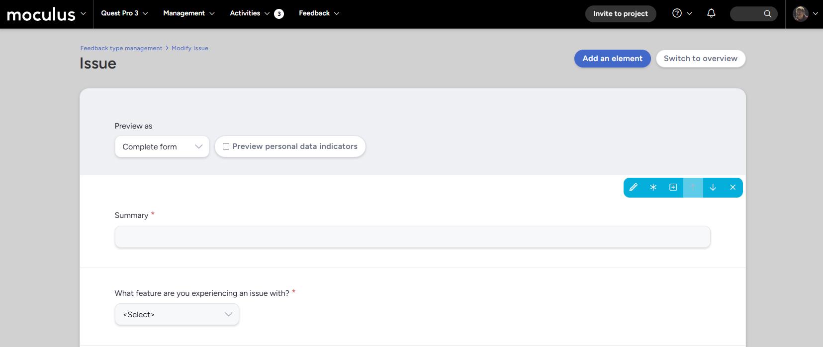
The form view screen gives you a complete list of all elements in the form, viewed as they will be seen by the submitter (with the addition of a number of admin-facing tools). In the upper right you will find two buttons:
Add an element: Takes you to the Create a form element screen to create an element from scratch.Switch to overview: Swaps to the feedback form overview view (explained below).
You are also given two different options that allow you to customize your view of the form:
Preview as: View the form as a member of the selected team. "Complete form" gives you full admin access to the form; you will see all form elements, including conditional elements listed. Selecting a "Preview as" team will present the form as if you were filling it out as a member of that team. You will only see form elements that the team has access to, and conditionals will only appear if the answers on which the conditionals are based have been selected.Preview personal data indicators: This checkbox toggles on or off the personal data infoboxes that will be displayed to the form submitter. This is for previewing the form only and does not effect what the submitter will see in the final published form.
When hovering over an element in the form view you will be presented with a toolbar providing a number of different actions that can be performed:
Modify: Take you to the Modify this form element page for the given element.Make required/optional: Toggles whether the element is required or optional (indicated by the red asterisk next to the elements title).Mark personal data: Toggles whether the element is intended to contain PII.Insert above: Takes you to the Create a form element screen, with the "Position" information already filled in to place the new element above the element you have selected.Move up: Swaps the elements position with the element above it.Move down: Swaps the elements position with the element below it.Remove: Removes the element (requires confirmation).
Lastly, if the form you are working on is not yet published, you will be presented with publication options. These depend on the type of form:
Publish: Activates the form and makes it available for all teams who have access.-
Publish and notify: Activates the form, makes it available for all teams who have access, and automatically opens the Notify screen which can be used to send an email to all users with submit access to the survey.
Form overview
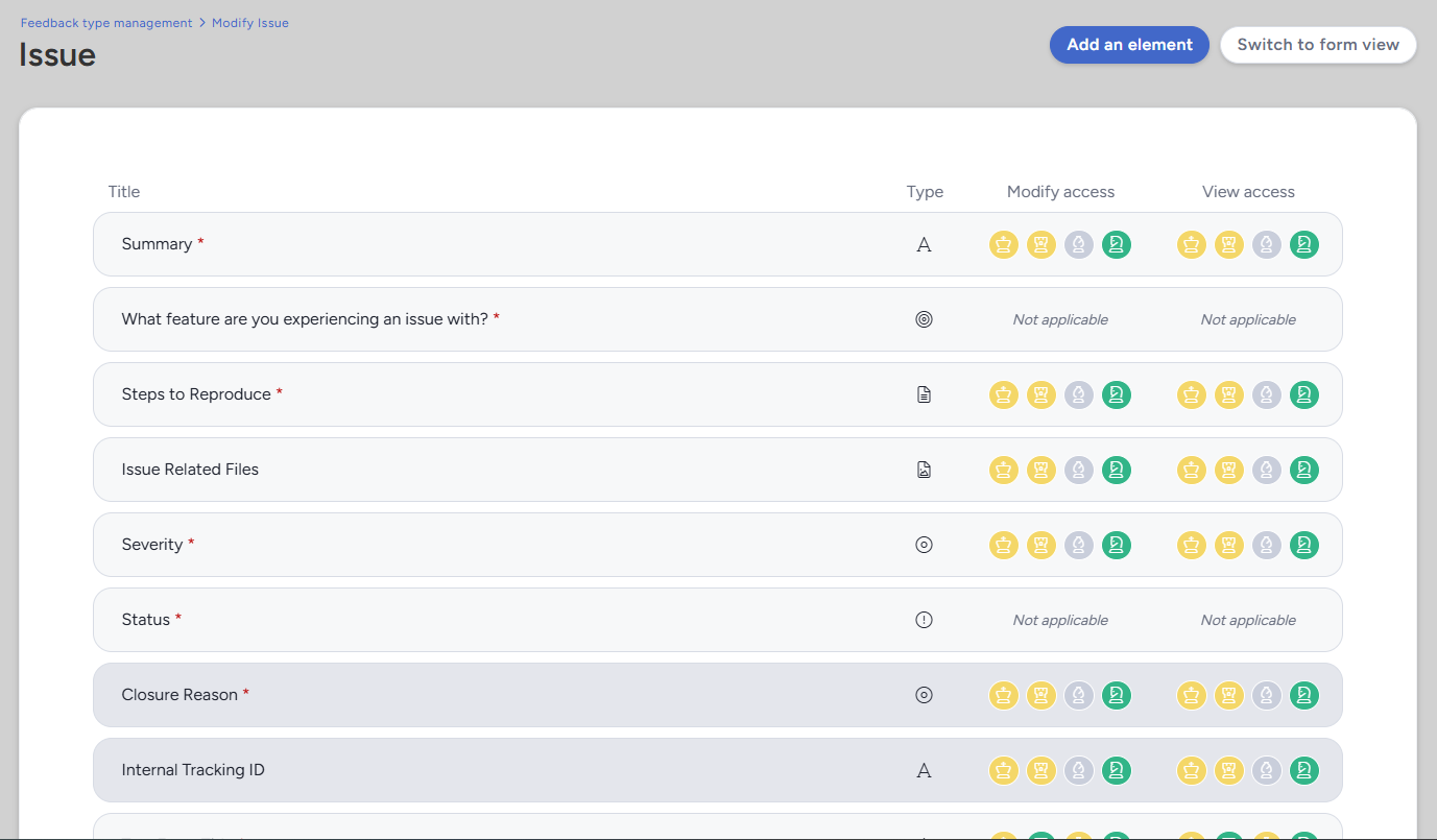
The form overview view gives you quick access to view some basic details about all elements on the form at a glance. This view will list all form elements, their titles, types, and a quick overview of their access. Hovering over a given element will give you the same toolbar options described above.